




The Cuppy Foundation (concept)
Logo Design Exploration for TCF.
View Presentation
Overview
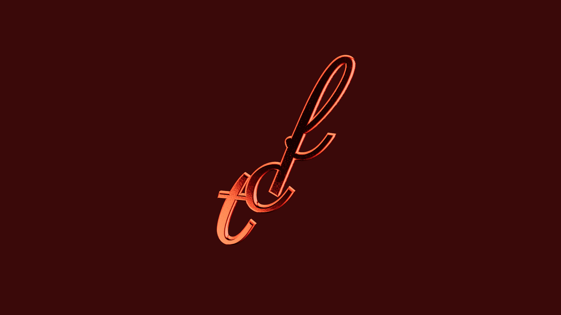
The Cuppy Foundation logo evolved through several iterations, resulting in a dual-system approach consisting of a Primary and a Secondary version.
The Primary Logo (the Letter Mark) is optimized for large-scale media like billboards, vehicle wraps, and social media headers. Conversely, the Secondary Logo (the Brand Mark) is tailored for high legibility on small-scale assets such as profile pictures, favicons, and app icons.
Contribution
The Brand Mark features a vertically ascending, staircase-like arrangement using the Parisienne typeface. This structural flow evokes a sense of progress and upward mobility, offering a compelling visual metaphor for growth that can be leveraged in brand storytelling.
The Letter Mark features a vertical stacking of Open Sans Condensed, creating a structured silhouette reminiscent of a pile of books or crates. While this structural effect was an organic outcome of the design process, it provides a versatile foundation for future marketing narratives centered on building blocks or knowledge.
Key Design Decisions
The logomark draws from an upward arc—a direct visual metaphor for lifting young people toward their potential. This shape is simultaneously abstract enough to feel modern and legible enough to read instantly at small sizes.
A warm gold and coral palette was selected over the more typical nonprofit blues and greens. The colors radiate optimism and energy—mirroring the spirit of the youth programs the foundation runs.
Typography is approachable and rounded, deliberately avoiding the stiffness typical of institutional brands. The hierarchy ensures the foundation’s mission statement always reads first across any collateral.
Results
The final deliverables consist of a dual-logo system designed for versatility, with both the Primary and Secondary versions optimized for high-contrast performance in either black or white variants.
The Cuppy Foundation (concept)
Logo Design Exploration for TCF.
View Presentation
Overview
The Cuppy Foundation logo evolved through several iterations, resulting in a dual-system approach consisting of a Primary and a Secondary version.
The Primary Logo (the Letter Mark) is optimized for large-scale media like billboards, vehicle wraps, and social media headers. Conversely, the Secondary Logo (the Brand Mark) is tailored for high legibility on small-scale assets such as profile pictures, favicons, and app icons.
Contribution
The Brand Mark features a vertically ascending, staircase-like arrangement using the Parisienne typeface. This structural flow evokes a sense of progress and upward mobility, offering a compelling visual metaphor for growth that can be leveraged in brand storytelling.
The Letter Mark features a vertical stacking of Open Sans Condensed, creating a structured silhouette reminiscent of a pile of books or crates. While this structural effect was an organic outcome of the design process, it provides a versatile foundation for future marketing narratives centered on building blocks or knowledge.
Key Design Decisions
The logomark draws from an upward arc—a direct visual metaphor for lifting young people toward their potential. This shape is simultaneously abstract enough to feel modern and legible enough to read instantly at small sizes.
A warm gold and coral palette was selected over the more typical nonprofit blues and greens. The colors radiate optimism and energy—mirroring the spirit of the youth programs the foundation runs.
Typography is approachable and rounded, deliberately avoiding the stiffness typical of institutional brands. The hierarchy ensures the foundation’s mission statement always reads first across any collateral.
Results
The final deliverables consist of a dual-logo system designed for versatility, with both the Primary and Secondary versions optimized for high-contrast performance in either black or white variants.
The Cuppy Foundation (concept)
Logo Design Concept for TCF.
View Presentation

Overview
The Cuppy Foundation logo evolved through several iterations, resulting in a dual-system approach consisting of a Primary and a Secondary version.
The Primary Logo (the Letter Mark) is optimized for large-scale media like billboards, vehicle wraps, and social media headers. Conversely, the Secondary Logo (the Brand Mark) is tailored for high legibility on small-scale assets such as profile pictures, favicons, and app icons.
Contribution
The Brand Mark features a vertically ascending, staircase-like arrangement using the Parisienne typeface. This structural flow evokes a sense of progress and upward mobility, offering a compelling visual metaphor for growth that can be leveraged in brand storytelling.
The Letter Mark features a vertical stacking of Open Sans Condensed, creating a structured silhouette reminiscent of a pile of books or crates. While this structural effect was an organic outcome of the design process, it provides a versatile foundation for future marketing narratives centered on building blocks or knowledge.
Key Design Decisions
The logomark draws from an upward arc—a direct visual metaphor for lifting young people toward their potential. This shape is simultaneously abstract enough to feel modern and legible enough to read instantly at small sizes.
A warm gold and coral palette was selected over the more typical nonprofit blues and greens. The colors radiate optimism and energy—mirroring the spirit of the youth programs the foundation runs.
Typography is approachable and rounded, deliberately avoiding the stiffness typical of institutional brands. The hierarchy ensures the foundation’s mission statement always reads first across any collateral.
Results
The final deliverables consist of a dual-logo system designed for versatility, with both the Primary and Secondary versions optimized for high-contrast performance in either black or white variants.